")
In this episode of Success On Paper, we’re diving into the magic of the 3-Click Rule—a simple yet powerful way to ensure your website is easy to navigate and converts visitors into paying clients. If your potential clients can’t find what they need in three clicks or less, they’re leaving. Learn how to simplify your website navigation, optimize your calls to action, and make booking a breeze. Plus, I’ll share a real-life client story that proves these small changes can double your inquiries!
Subscribe & download the episode to your device: Apple Podcasts | Spotify | Amazon Music | Podchaser
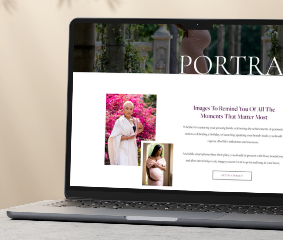
I need to tell you a little story about one of my clients—we’ll call her Emma. Emma is a talented wedding photographer with gorgeous work. Her website? Equally stunning. But there was just one problem…
Nobody was booking.
Emma came to me frustrated, wondering why her inquiries were so low. She had traffic coming to her site, but somehow, those visitors weren’t converting into clients.
So, like any good website strategist, I put on my detective hat and started clicking through her site.
And within seconds, I spotted the issue:
- Her pricing was buried under three different pages.
- Her inquiry form was hidden and hard to find.
- Her “Book Now” button was tiny and tucked away at the bottom of the page.
Whew. No wonder she wasn’t booking!
Why Your Website Might Be Costing You Clients
Let’s be real—no one has time to dig through a confusing website. If someone lands on your page and can’t find what they need in just a few clicks, they’re gone.
This is where the 3-Click Rule comes in.
The 3-Click Rule is simple: A visitor should be able to find exactly what they need in three clicks or less.
- Need to see pricing? One, two, three—there it is.
- Want to book a call? One, two, three—done.
- Looking for your services? Click, click, click—found it.
If it takes more than that, your website needs a glow-up.

How to Make Your Website Effortless to Navigate
So how do we fix this? Here are four quick (but powerful) changes you can make today:
Step 1: Make Your Navigation Stupid-Simple
Ever landed on a website where the menu bar has so many options, you don’t even know where to click? Yeah, don’t do that.
Your navigation should include:
✔️ About
✔️ Services (or Work With Me)
✔️ Contact
✔️ Portfolio (if applicable)
✔️ Blog (just call it ‘Blog’—not ‘Journal’ or something cutesy!)
Pro Tip: The Home button? You don’t need it. Your logo should always link back to the homepage—most people already know this.
Step 2: Put a “Book Now” or “Inquire” Button Everywhere
If you make people hunt for how to work with you, they won’t.
Your CTA (Call to Action) button should be:
- Above the fold (visible without scrolling on the homepage).
- At least every other section throughout your site.
- At the bottom of every page (because some people scroll first!).
This small change alone can make a massive difference.
Step 3: Be Transparent About Pricing
Let’s talk about a hot topic—should you list your prices?
I know, I know. Some business owners fear that listing pricing will scare off potential clients. But here’s the truth: People WANT to know what to expect.
Even if you offer custom pricing, give them something to work with. Instead of hiding your rates, say:
“Packages start at $____.”
“Custom pricing available—book a discovery call to learn more.”
This removes the guessing game and builds trust upfront.
Step 4: Test Your Own Website Like a Stranger Would
Imagine you’re a brand-new visitor to your website. Now ask yourself:
- Can I find pricing in three clicks or less?
- Can I book a call easily?
- Do I know exactly what services are being offered?
If not, it’s time for a website refresh.
👀 Even better? Ask a friend to test it for you! Fresh eyes will always catch things you’ve overlooked.
Back to Emma—Did These Fixes Work?
Absolutely.
We made three simple changes to her website:
✔️ Moved her inquiry button to the top of every page.
✔️ Created a clear services page with easy-to-read breakdowns.
✔️ Added pricing transparency so clients knew what to expect.
What happened next?
📈 Her inquiry rate doubled in a month.
📈 Clients booked faster because they didn’t have to ask for info—it was all there.
Moral of the story?
❌ A confusing website makes clients hesitate.
✅ A clear website makes them click.
So, now it’s your turn!
Your Next Steps…
Take 5 minutes today to test your website.
- Can a stranger find your pricing, services, and booking page in three clicks or less?
- If not, what can you simplify?
Until next time—your website should work for you, not against you!


")
")

