Did you know that more than 60% of website traffic comes from mobile devices? If your website isn’t mobile-friendly, you could be frustrating potential clients and losing business. The good news? Showit makes mobile optimization easy, allowing you to create a stunning, seamless experience on any device.
As a Showit website designer, making sure your website looks just as good on mobile as it does on desktop is essential for user experience, SEO, and conversions. In this guide, I’ll show you how to optimize your Showit website for mobile, covering everything from resizing elements to common mistakes to avoid.
Why Mobile Optimization Matters for Showit Websites
In today’s world, more people browse websites on their phones than ever before. That means if your website isn’t designed with mobile users in mind, you could be frustrating potential clients and pushing them away before they even get a chance to see your services.
Mobile optimization is essential because:
- User Experience Matters – If visitors can’t navigate your site easily, they’ll leave. A mobile-friendly design ensures a smooth, enjoyable experience.
- Google Prioritizes Mobile-Friendly Sites – Google now uses mobile-first indexing, meaning that if your site isn’t optimized for mobile, it could hurt your search rankings.
- More Clients Book on Mobile – Potential clients often browse and inquire from their phones. If your contact forms or booking pages aren’t mobile-friendly, you might be losing leads.

6 Ways to Optimize Your Showit Website for Mobile
1. Resize Elements for Mobile Viewing
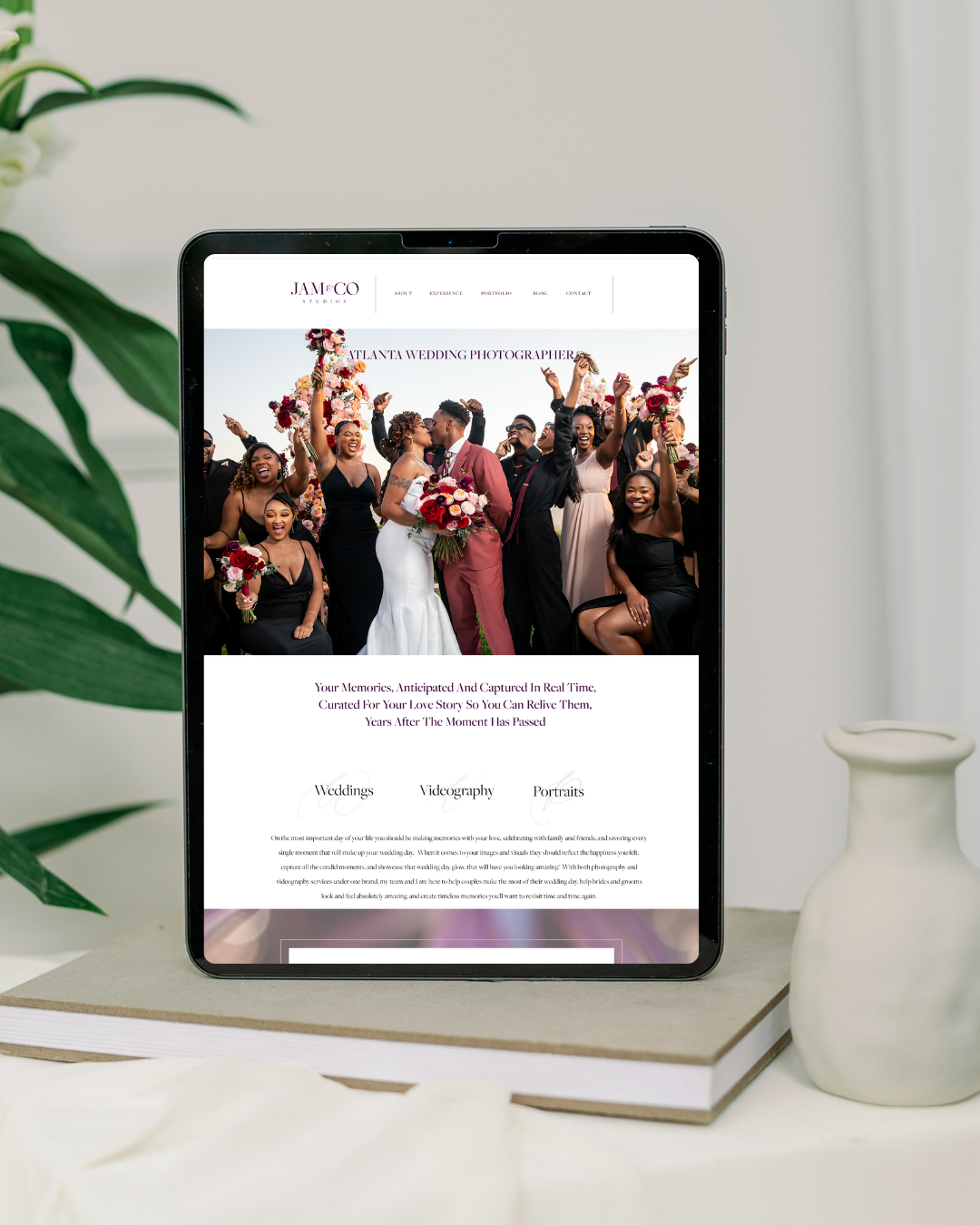
One of the best things about Showit is its separate mobile editor, which lets you design your mobile experience independently of your desktop layout. That means you’re not stuck with a one-size-fits-all mobile version like other platforms.
How to Optimize:
- Adjust text and image sizes to fit the screen properly.
- Keep margins and padding balanced for a clean, professional look.
- Ensure key content is above the fold (visible without scrolling).
Pro Tip: Use Showit’s “Lock Elements” feature to ensure certain sections stay in place for mobile users.
2. Choose Mobile-Friendly Fonts
Text should be easy to read on smaller screens. Avoid overly decorative fonts that become difficult to read when scaled down.
Best Practices:
- Test headings and subheadings to ensure they scale properly.
- Use a minimum font size of 16px for body text.
- Limit line length to 50-75 characters per line for readability.
Mobile users won’t wait around for slow-loading pages. Large, unoptimized images can slow down your site and increase bounce rates.
3. Optimize Images for Faster Load Times
A slow website = a lost visitor. High-resolution images that aren’t optimized can slow down your Showit website, causing frustration for mobile users.
How to Fix It:
- Compress images using tools like TinyPNG or JPEGmini before uploading.
- Avoid using excessively large background images that increase load time.
- Use Showit’s responsive settings to ensure images scale properly.
4. Make Buttons & Links Easy to Tap
Ever tried to click a tiny button on a phone, only to accidentally tap the wrong thing? 😬 Annoying, right? Your mobile design should be finger-friendly, meaning buttons and links are large enough to tap without frustration.
Best Practices:
- Buttons should be at least 44px by 44px to ensure easy tapping.
- Add ample spacing around clickable elements to prevent misclicks.
- Use contrasting colors to make buttons stand out.
5. Test Your Website on Multiple Devices
Don’t assume that just because your site looks good on one phone, it works perfectly on all mobile devices. Test your Showit site on different screen sizes to catch any layout issues.
How to Test:
- Use Google Chrome’s Responsive Viewer Extension to view your site in different screen sizes (Right-click → Inspect → Toggle Mobile View).
- Check your site on an iPhone, Android, and tablet to see how it performs.
- Get feedback from others—sometimes a fresh pair of eyes will catch things you didn’t notice.
6. Improve Mobile SEO for Your Showit Website
Having a mobile-friendly website is great, but you also want Google to rank your site so potential clients can find you.
Here are some quick SEO fixes:
- Use Descriptive Page Titles & Meta Descriptions – Ensure each page has a keyword-rich title and meta description.
- Optimize for Page Speed – Google prioritizes fast-loading sites, so compress images and reduce unnecessary elements.
- Keep Content Readable – Use short paragraphs, bullet points, and clear headers to make content easy to skim.
At the end of the day, optimizing your website for mobile ensures a seamless user experience, improves search rankings, and increases conversions. By resizing elements, optimizing images, and simplifying navigation, you create a site that looks stunning and works on any device. Showit’s powerful customization tools make it easy to build a site that’s both pretty and functional.
Ready to optimize the mobile side of your Showit website to the next level? Let’s chat today!


