One of my favorite things about designing Showit websites is typography!
The fonts you choose can have a huge impact on the design of your website. The right fonts can take your website from just okay to AH-MAZING!
Here are some key terms to help choosing feel less intimidating.
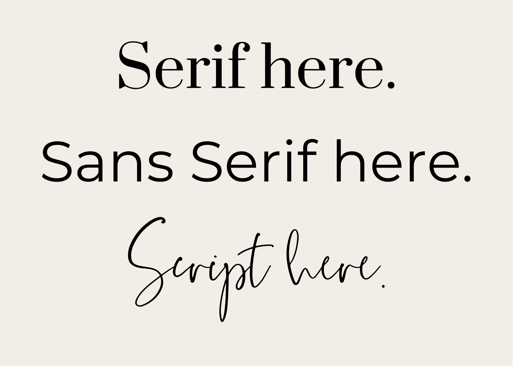
Serif: A serif font has “feet” or decorative strokes at the end of each character. Serif fonts tend to be more on the classic side.
Sans Serif: A sans serif font does not have these strokes. Sans serif tend to be more on the modern side.
Script: A script font is a font intentionally created to look like cursive or calligraphy. Creative Market has a ton of script fonts that I love to incorporate into my designs. These are ideal as accent fonts on your website.

Things to remember when pairing fonts:
DO’s
DONT’s
- Keep it simple. Choose 2-3 fonts.
- Consistency is key. Use the same font for all headers, subheadings, paragraphs, etc.
- Serif + Sans Serif has good contrast and work well together.
- DO NOT italicize large bodies of text.
- DO NOT pair script with serif fonts.
- DO NOT italicize sans serif fonts.
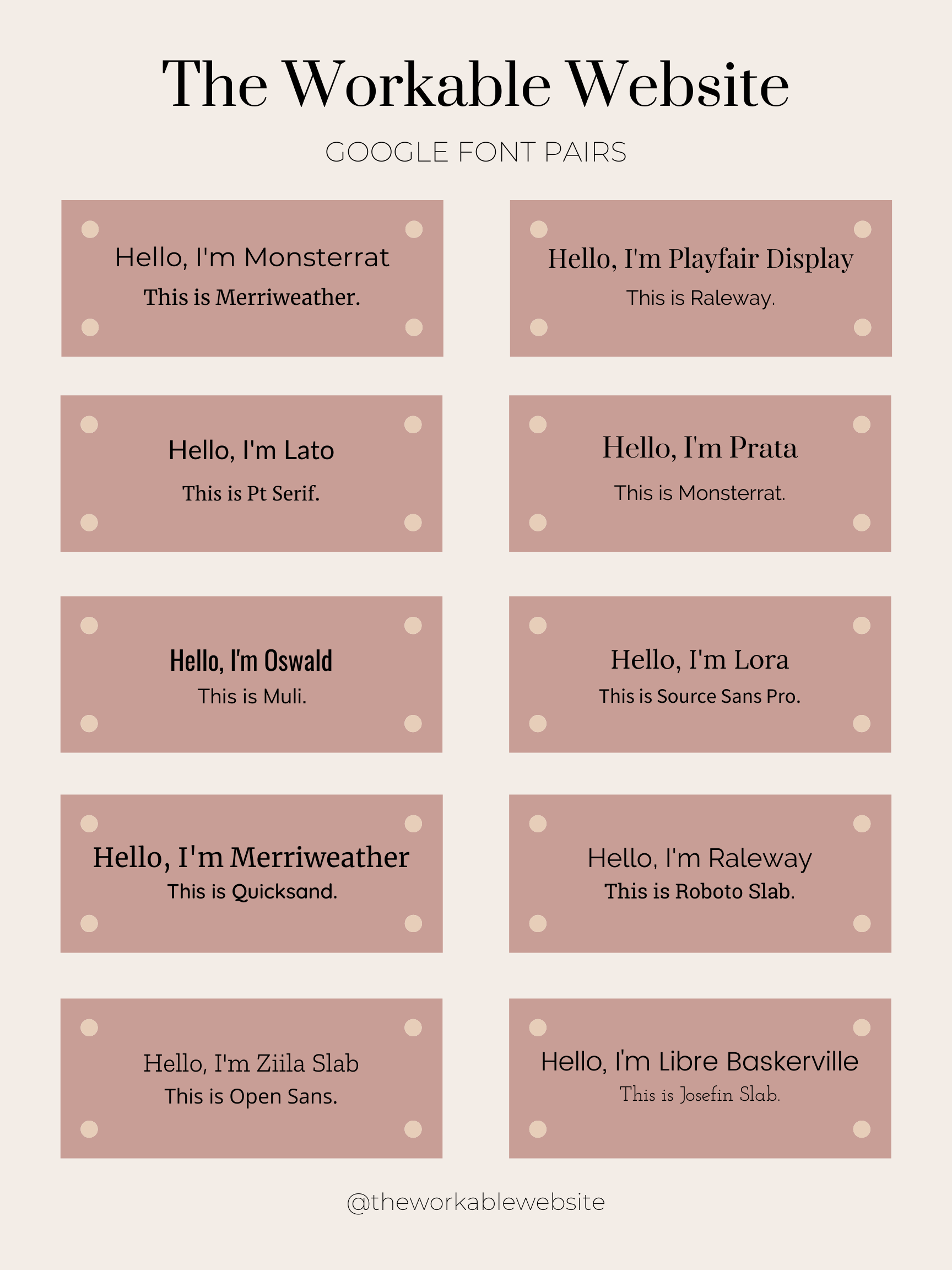
There were SO many fonts out there, shifting through them can be an adventure, right? One of the many reason I love designing in Showit is that they have over 800 preloaded goggle fonts. Having that many options can be overwhelming when deciding which ones to use. So I’ve jotted down 10 of my go-to goggle font pairs.

I’d love to hear what your favorites are! Cheering You On 🙂